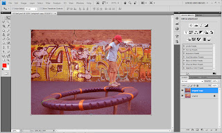
the original image but after i cropped out the white overlaps but before any further changes, not really goo so i tried to make it better!!
-the original image needed some cropping which i already did and even adjusted the brightness and contrast. -to adjust the brightness and contrast you go to image(with layer selected) adjustments> brightness contrast
-next try to adjust the color in order to show some variation which brings out the beauty in the picture.
-i normally change them in RGB color format it should be easy to adjust the reds, greens and the blues.
-i selected the t-shirt and put the exposure completely down to make it dark.
-i did the same to the shorts, and cap to make them differ from the original.
-the wall with graffiti can be a stubborn thing so all channels must be taken care of, u need to adjust the yellows and to do that its best u put it in cmyk color setting.
-i then adjusted each color carefully to avoid leaving out any detail,
- u can go to image adjustments, levels or curves..
-i however came to simple conclusion that simply emphasizing every color in the image and of-course the skin tone to match the composition would do good, so i did exactly that and i came up with something like that. looks pretty good,


No comments:
Post a Comment